INTRODUCTION
The Food4U resources I started with were a startup kit that included:
-
The project brief analysis
-
User research highlights
-
A persona
-
Implementing the new features requested by stakeholders and UCLA students
THE PROBLEM
Some Research Findings
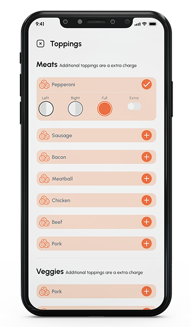
- Food4U experiences for customers want a better way to order their food and a better way to customize their order.
- Customers are having difficulty in locating their previous order. Can you think a way to surface past orders efficiently and quickly?
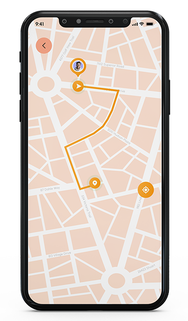
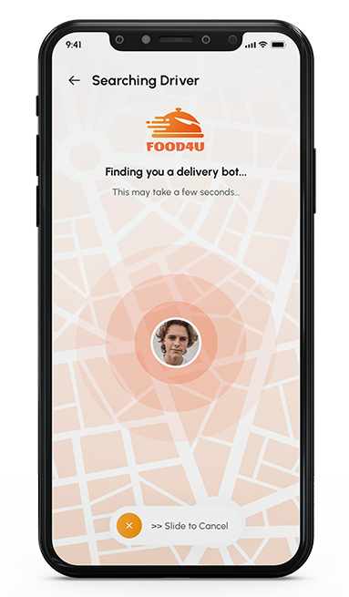
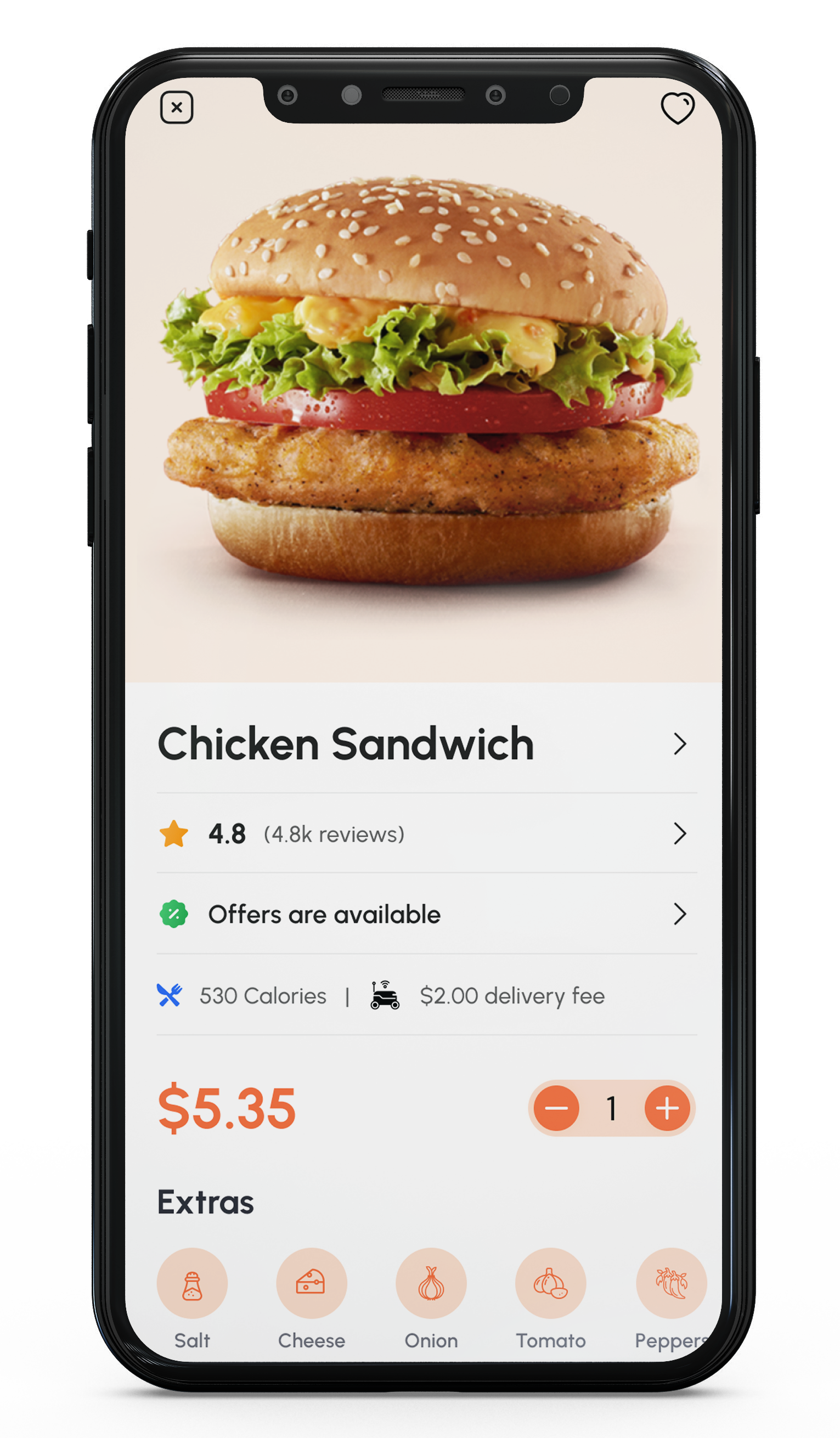
- Through user surveys we have learned that users would like real- time order status updates. Design a way for customers to visualize order status, process and following the delivery.
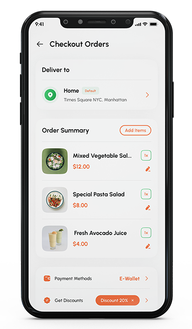
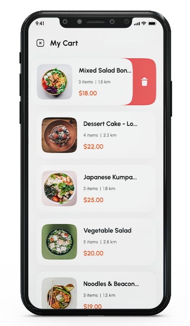
- Research shows that users add items to their cart but do not complete the purchase process because there are too many steps and the cart is hard to edit. Simplify the process.
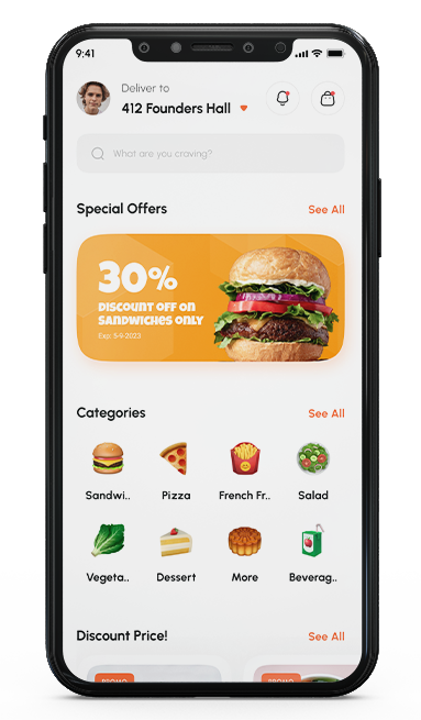
- User research indicates that new user spends less than 30 seconds on the home screen after their initial login. Design engaging home screen layout that walks them through the process of ordering food.
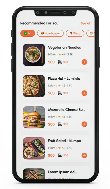
- Design a search experience that allow users to quickly and find relevant food options.
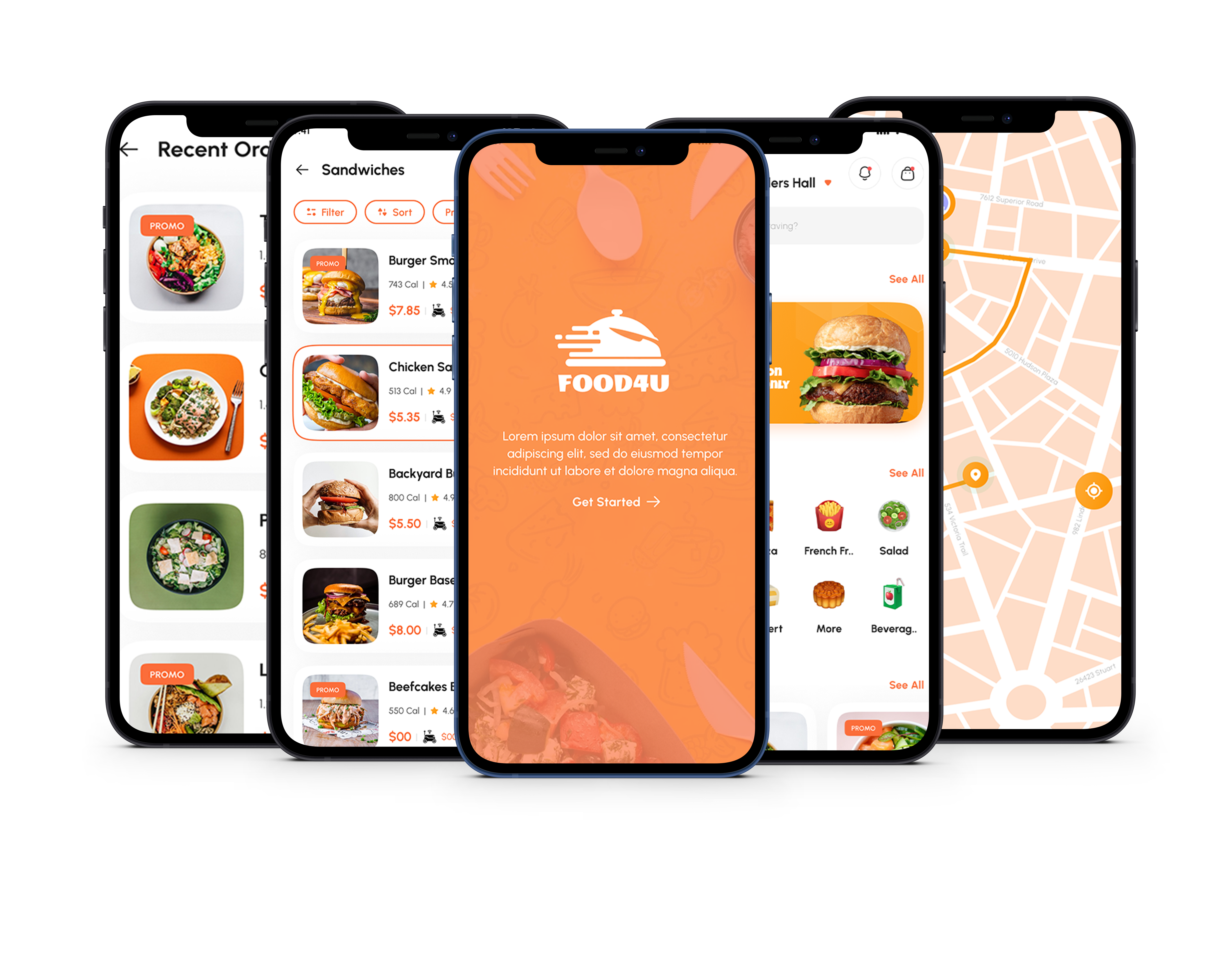
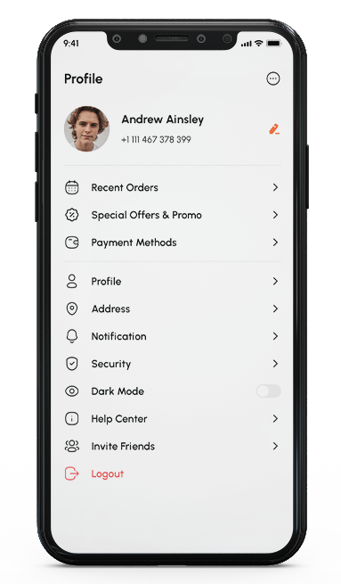
High Fidelity Prototype
Summary
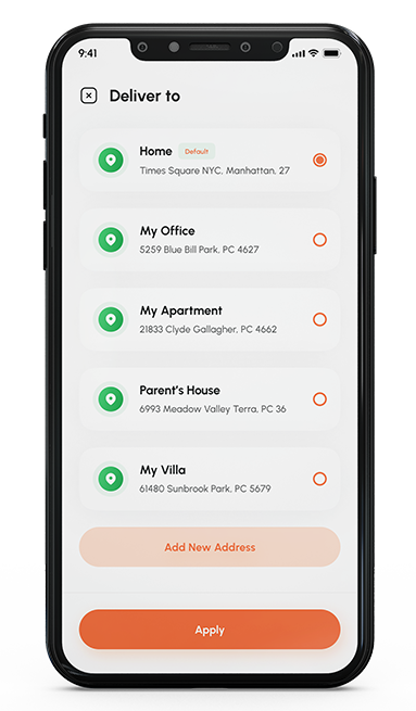
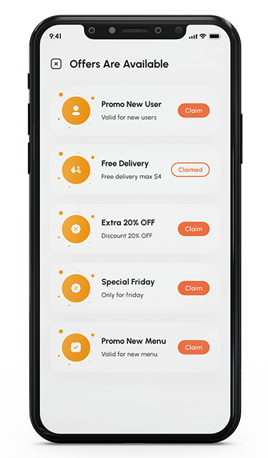
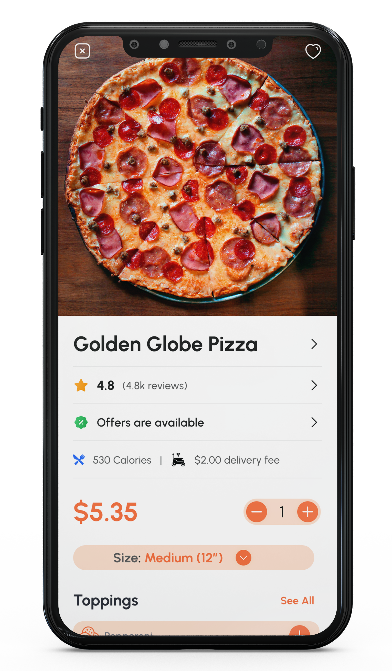
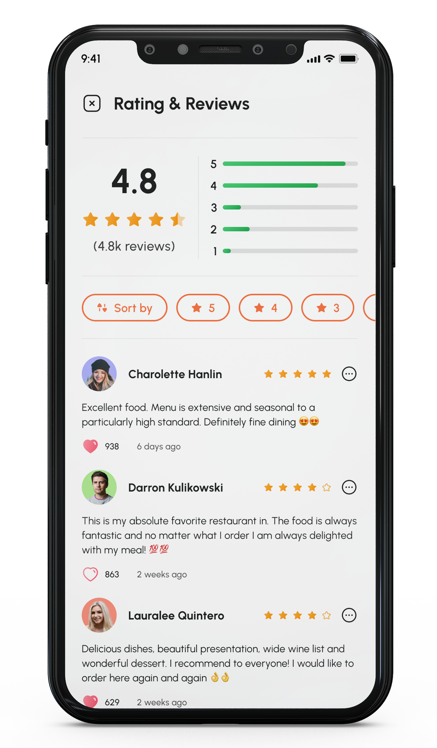
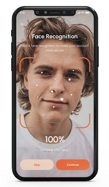
Food4U improves the user experience by offering a convenient platform for ordering food and delivering it on and off campus. Its user-friendly interface, delivery tracking, flexible payment option, easily customization to an order, reward system and reading feedback on food options further enhance the user experience. The ability to customize orders and save past orders really increased the user satisfaction.
USER RESEARCH
METHODOLOGIES
- User Interviews
- Secondary Research
- Competitive Analysis
The majority of the population is crunched for time. We noticed people are ordering food, perusing various menus, checking ingredients, and evaluating the accuracy of restaurants’ operation details — all online. Convenient, efficient, and more attractive — this is what we are aiming for with our app. We want to tune in to our users’ expectations with precision. Ordering food online has never been easier.
I found that there are many apps for ordering food, but each has its advantages and disadvantages. The most common flaws are that the information about the food itself is not comprehensive. Secondly, the pictures are not very consistent with what people have actually eaten. Third, relatively high delivery fees will be charged for outbound apps. Fourth, many nav tasks are unclear and even confusing to users. Finally, they will spend more time looking for deals before finding their favorite foods and restaurants.
PERSONA
Who was I designing this product for
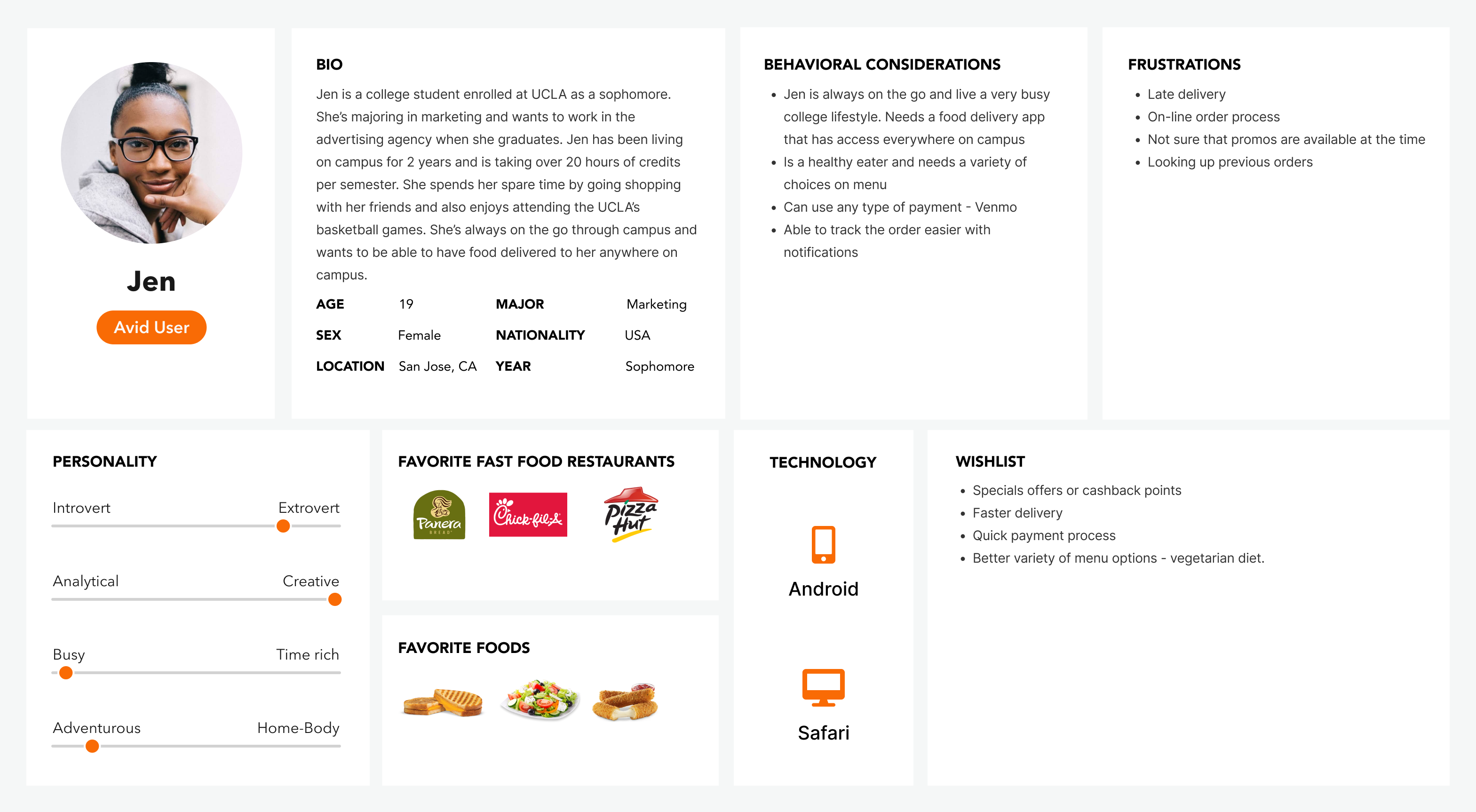
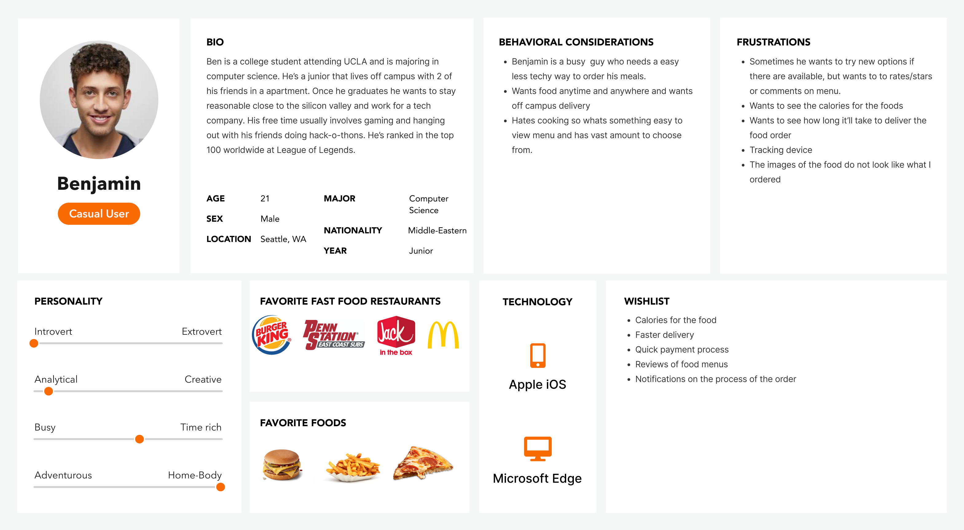
The best way to truly understand the needs and motivations of the people I’m designing for is by hearing from them. So, I interviewed five (5) college students at UCLA 18 and 23 years, who have some experience with ordering food online.
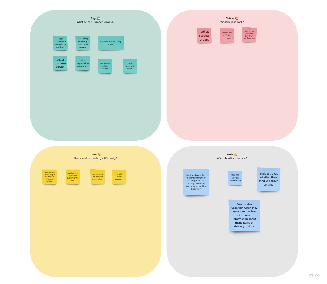
The participants’ responses can be summarised as follows:
- 5 out of the 5 participants said they are most likely to use a food ordering platform when they need a quick way to quench their hunger.
- 4 out of 5 participants said they do not like platforms that are difficult to use.
- 2 out of 5 participants prefer to pay for their food after delivery.
Below is a quick summary of 2 participants
ARCHITECTURE
METHODOLOGIES
- User Flows
- Low Fidelity Testing
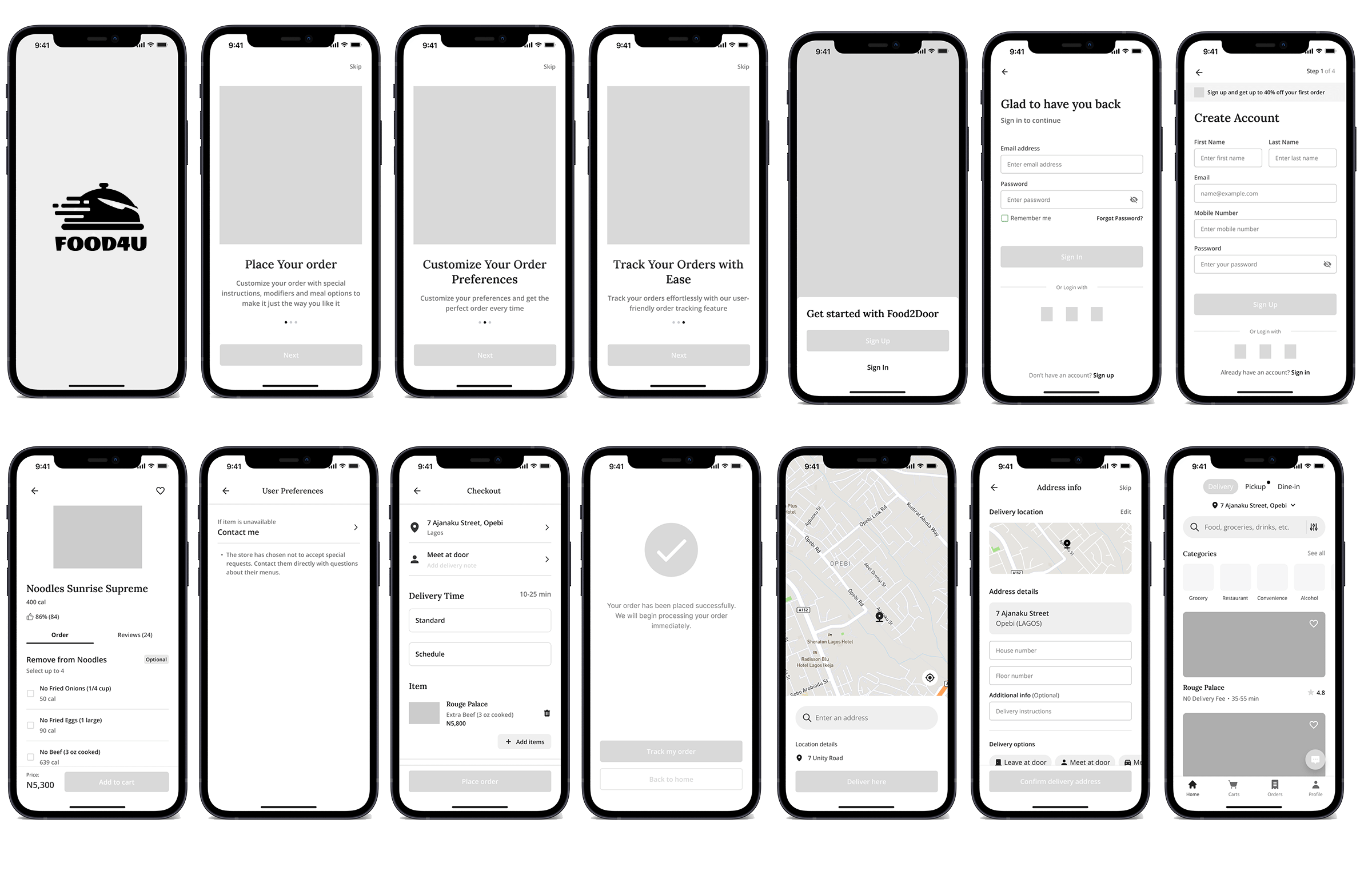
- Wireframing
- Wireflows
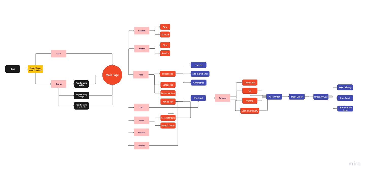
To achieve my goal of creating an intuitive design, I mapped a user flow that prioritized recognition over recall. This was done by creating a path that is familiar to the users. Also a quicker way to choose a food option, customizing the order easily, looking at reviews and comments and then checking out – along with tracking order
