INTRODUCTION
The Doctor on Demand resources I started with were a startup kit that included:
-
The project brief analysis
-
User research highlights
-
A persona
-
Implementing the new features requested by stakeholders and customer feedback
IDENTIFYING THE TARGET AUDIENCE
The first step in the project was to identify the target audience. Telehealth applications cater to a wide range of users, including healthcare professionals, patients, and even caregivers. It’s essential to define and understand the specific needs and preferences of each user group. So we first started internal with the healthcare employees and stakeholders to figure what best works for them getting all the information from the patient easy and in a very productive way.
Design Constraints to consider:
-
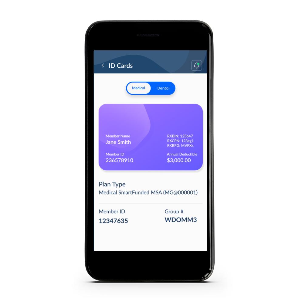
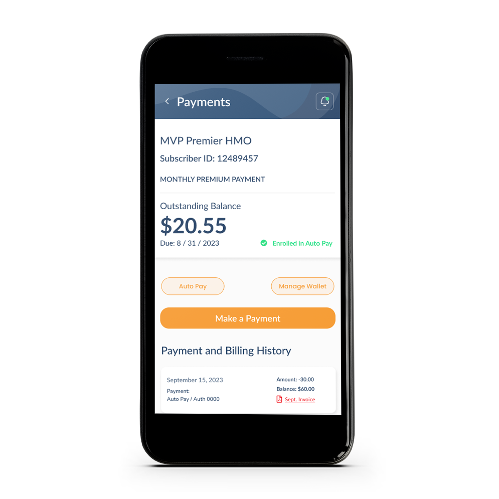
Improving the a quicker way to place a claim.
-
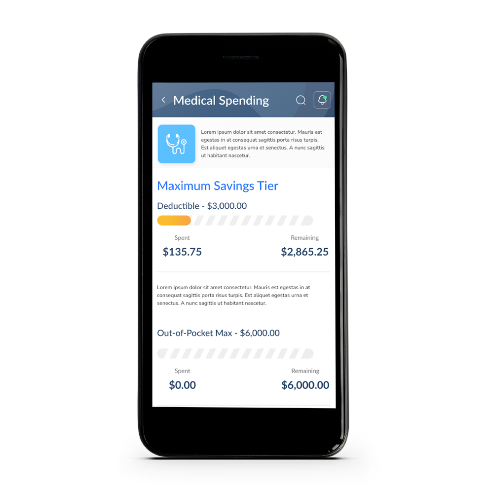
Easier way to find your financial information.
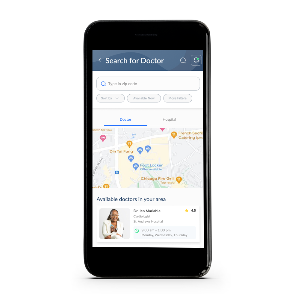
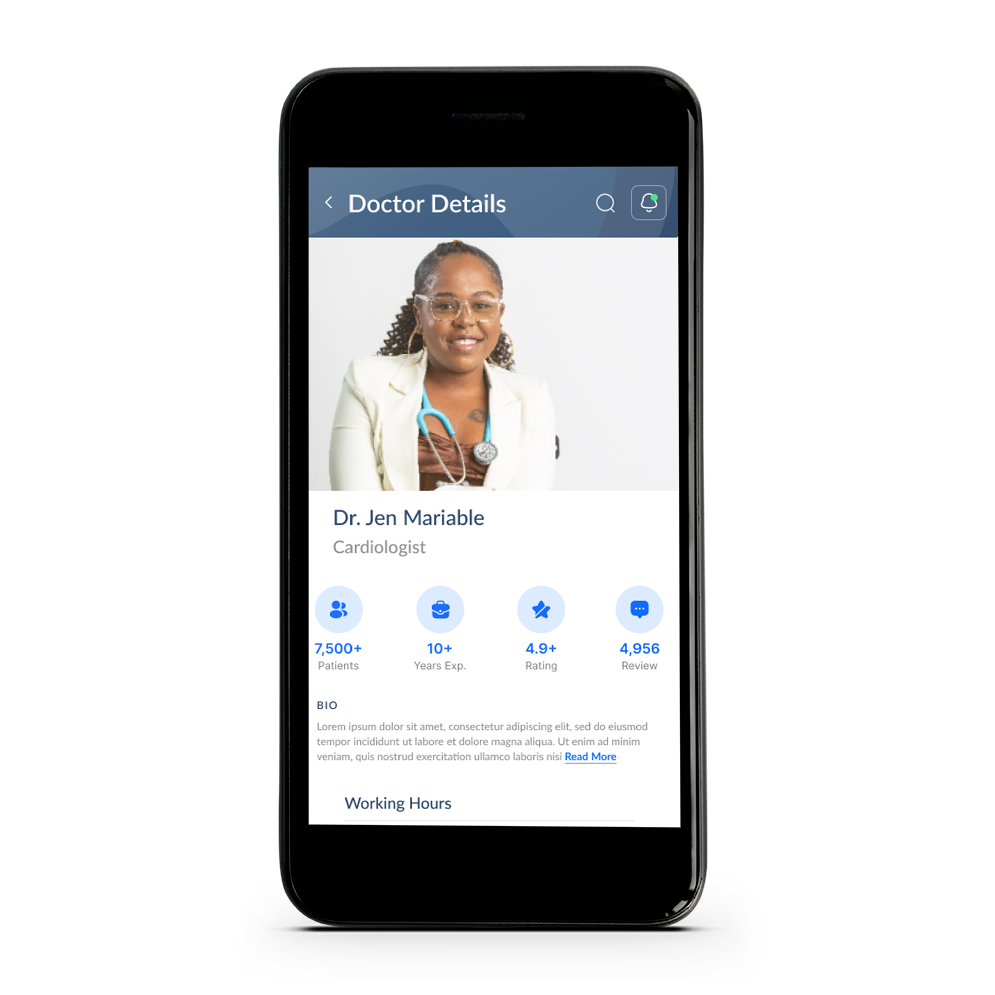
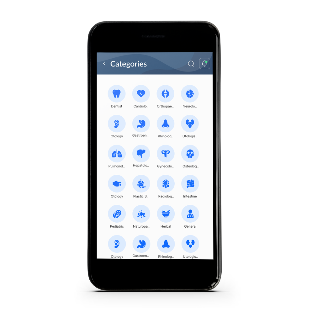
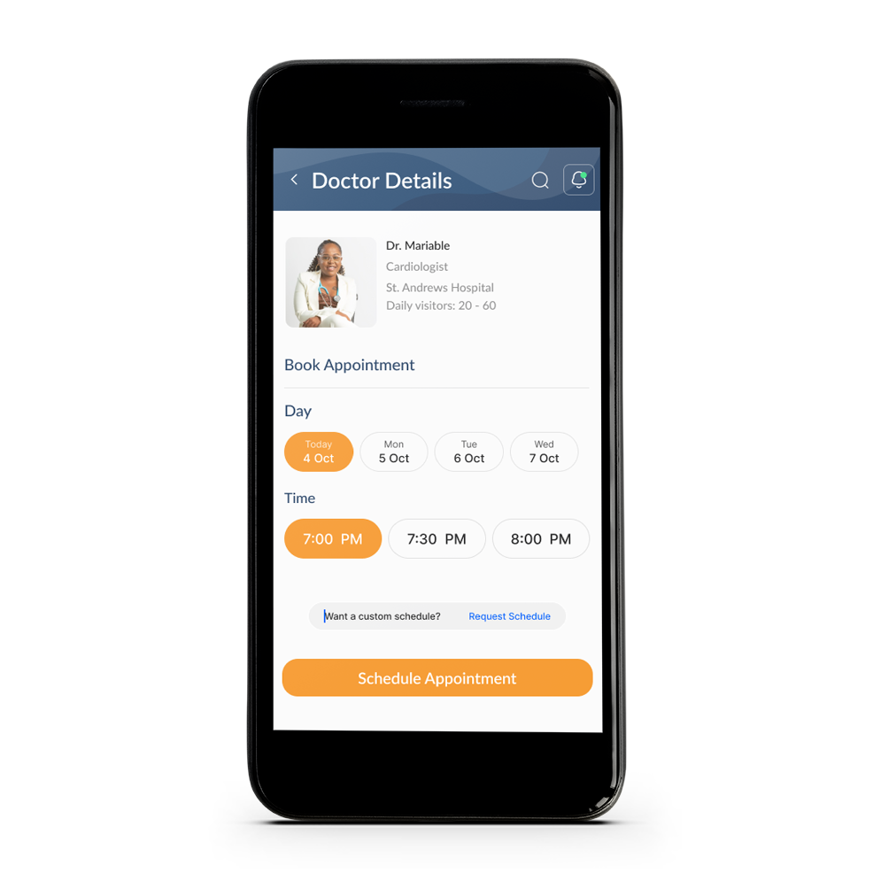
- Finding a doctor / hospital using a few clicks.
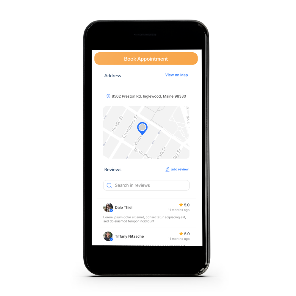
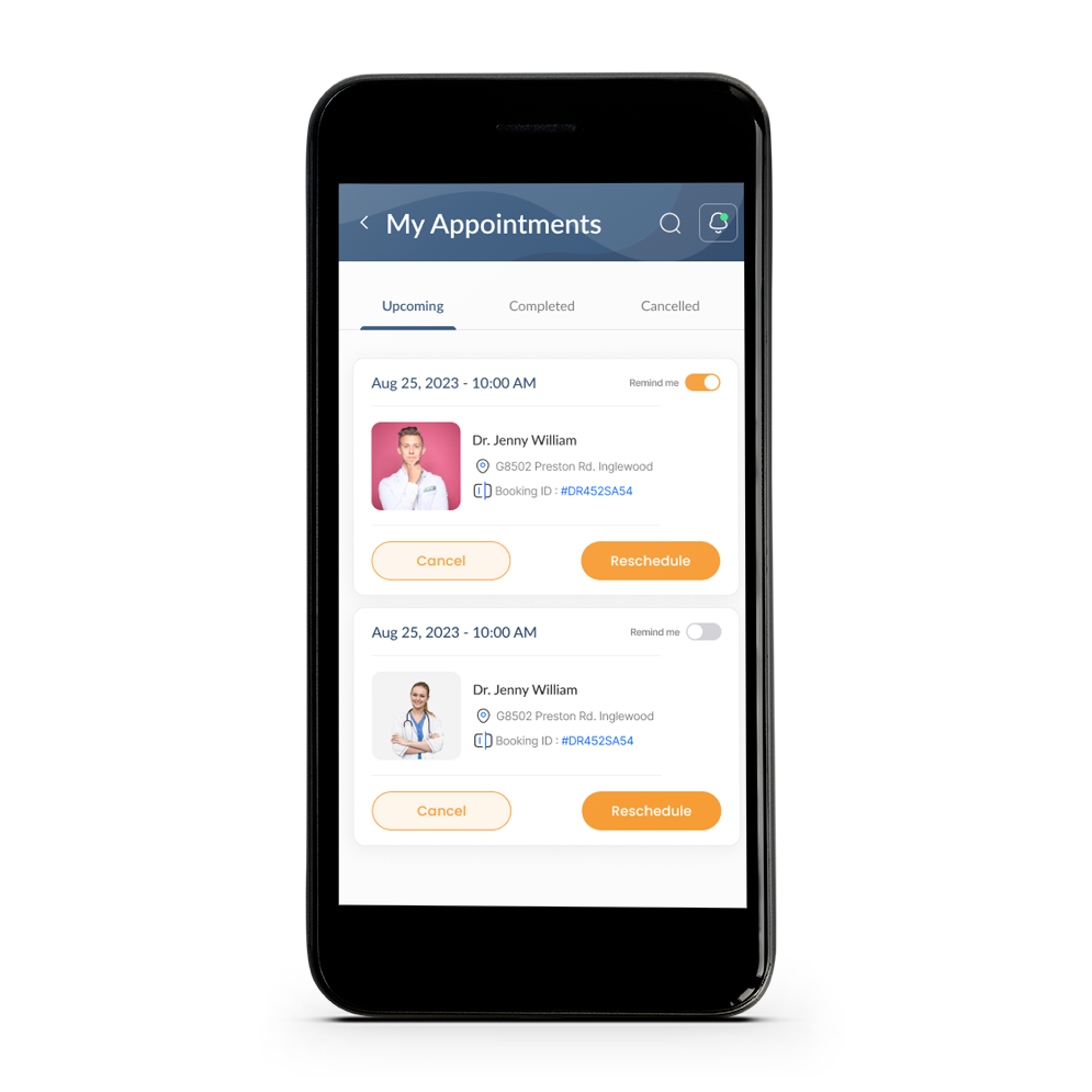
- Booking a medical appointment.
-
6 month timeframe.
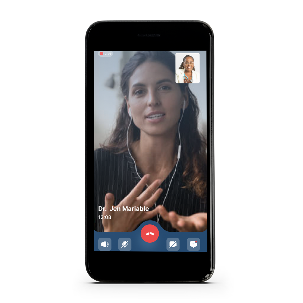
High Fidelity Prototype
Summary
Based on the insights gained from user research, iteratively refine the app’s design and functionality. Consider prototyping and testing new features before fully implementing them. We also continuously engaged with users throughout the development process. Regularly solicit feedback and conduct additional rounds of testing to ensure that the app aligns with user needs and expectations.
After launching the telehealth mobile app, monitor user feedback and app usage. Continue to make improvements based on real-world usage and changing user needs. User research for a telehealth mobile application is an ongoing process, as the healthcare landscape evolves, and user needs change. Regularly engaging with your user base and being responsive to their feedback is essential for the long-term success of the app.
USER RESEARCH
- Surveys: Designed surveys to gather quantitative data on user preferences, satisfaction levels, and any areas of improvement. These can be distributed to a larger pool of users for a broader perspective.
- Usability Testing: Perform usability testing with representative users. Observe how they interact with the app, identify any usability issues, and note areas where improvements are needed.
- Observations: Observe real-life telehealth consultations to gain insights into the actual user experience and identify any bottlenecks or challenges.
- Analysis and Synthesis: Analyze the collected data to identify common themes, pain points, and positive experiences. This analysis will help you prioritize the most critical changes or improvements needed.
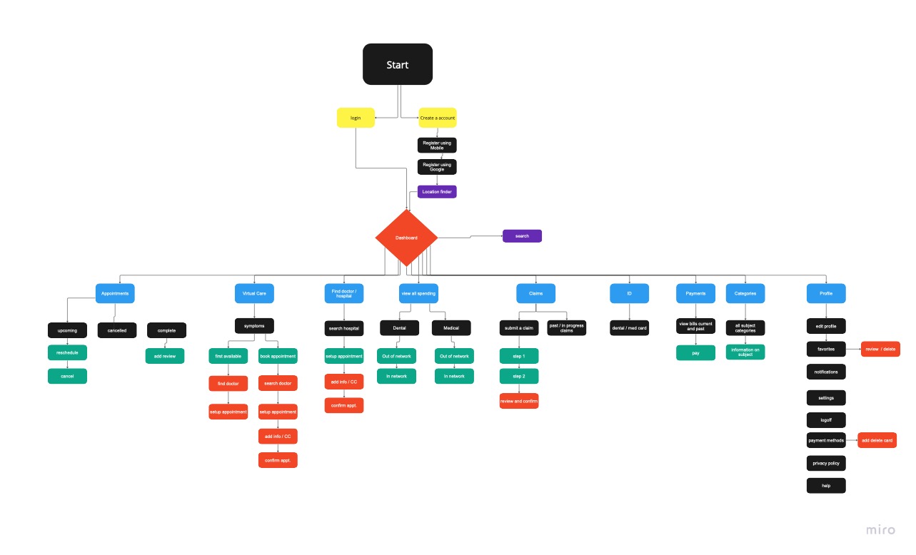
- User Flow: Created a user flow chart to establish a journey flow for the stakeholder and development team to understand the journey flow.
ARCHITECTURE
METHODOLOGIES
- Low Fidelity Testing
- Wireframing
- Wireflows
Since we caught important navigational and architectural issues in the earlier stages of testing from the original application.I was curious to see how the high-fidelity prototype would perform. My goal was to conduct testing using the User Testing software with different participants for each round.
LOW FI DESIGN LAYOUTS
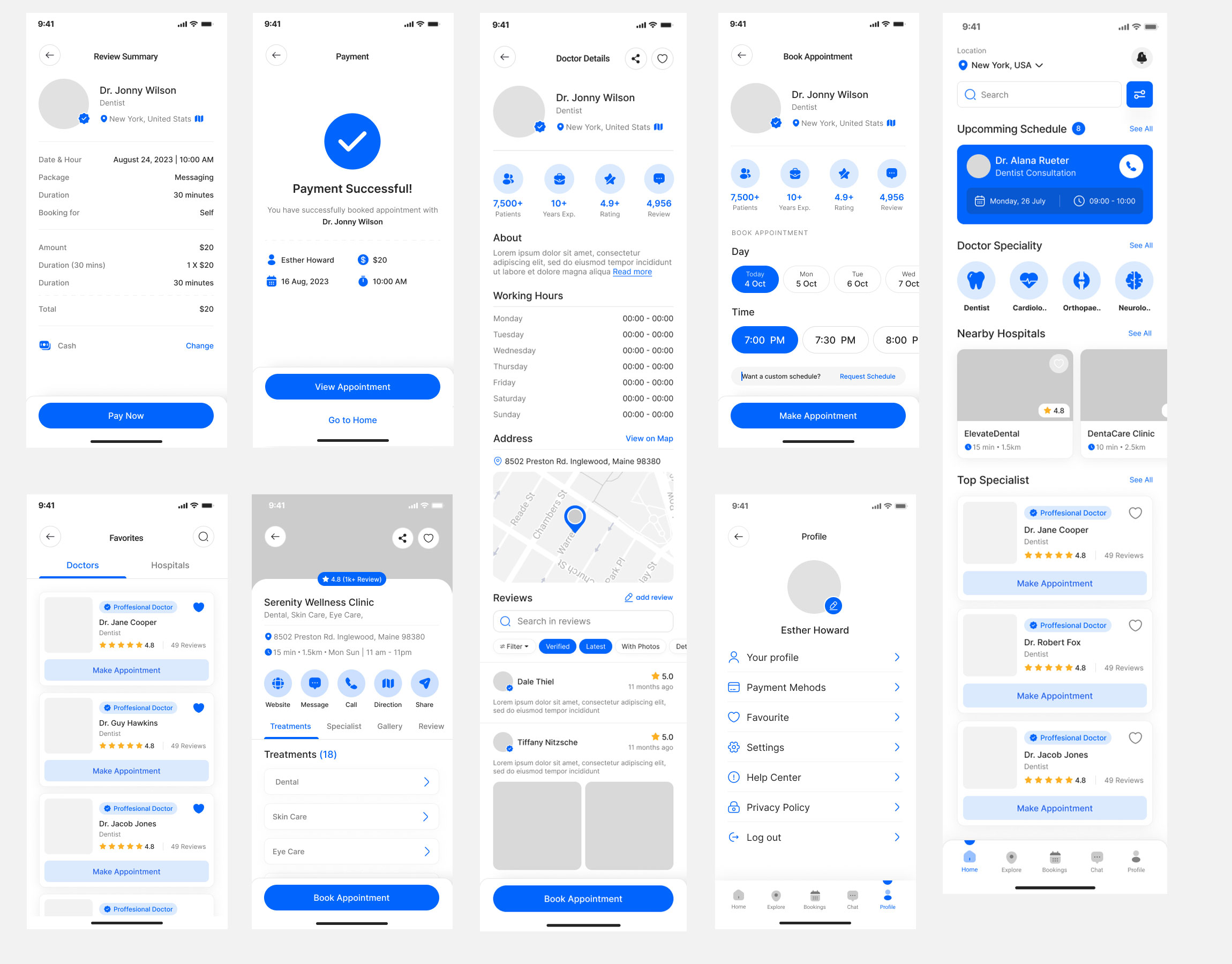
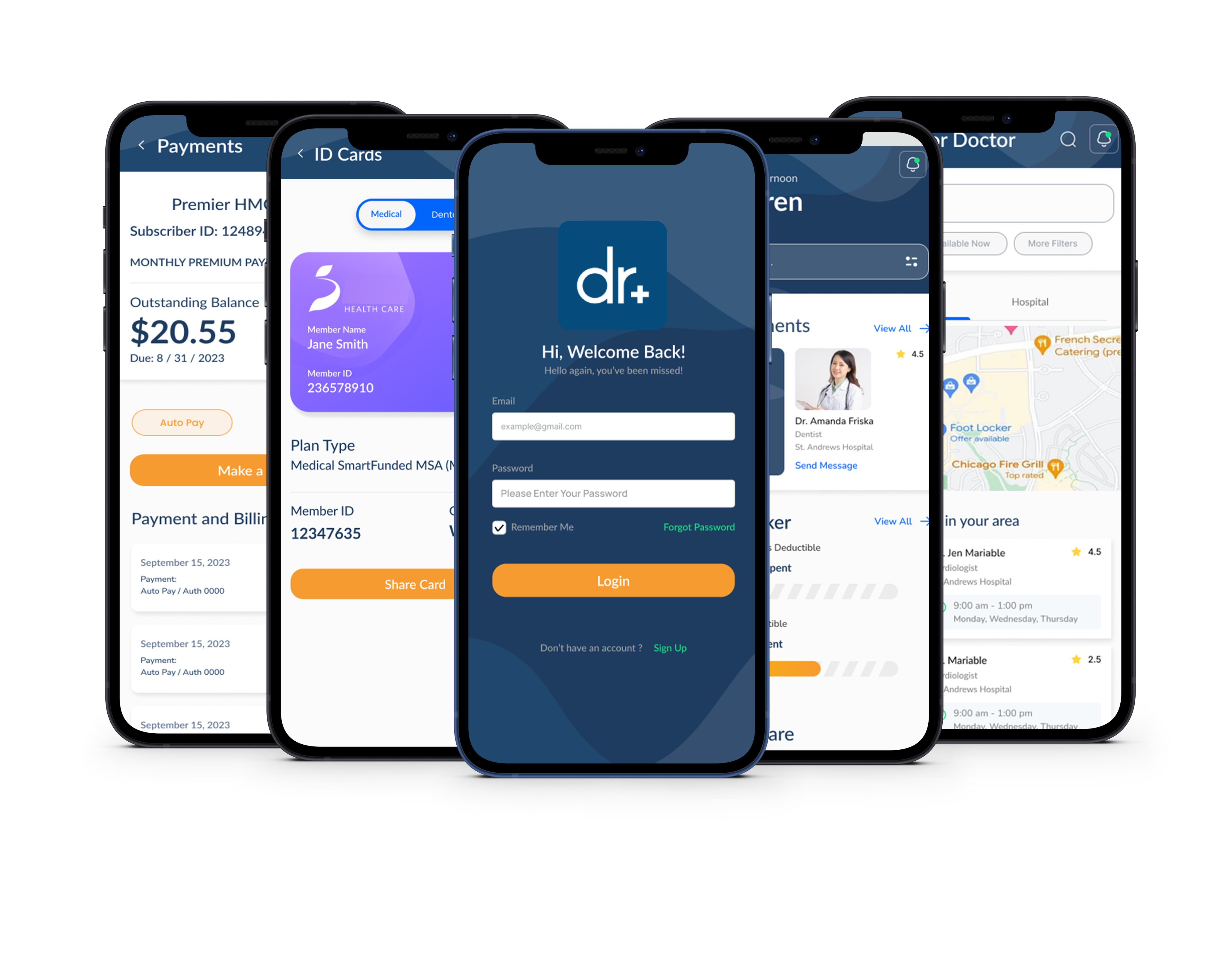
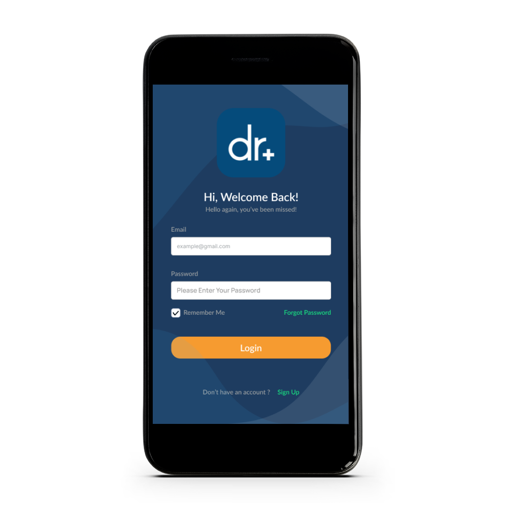
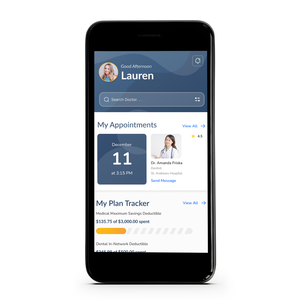
As a group we continuously engage with Doctor on Demand throughout the design process through low and high fidelity prototypes, while using DoD’s branding guidelines and also incorporating a whole new design system. Regularly solicit feedback and conduct additional rounds of design to ensure that the app aligns with user needs, expectations and an all around user experience.

