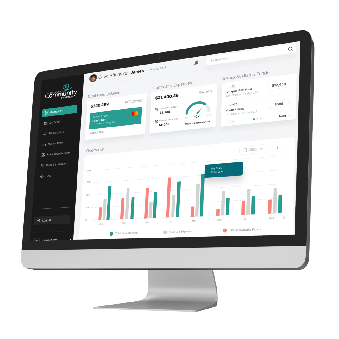
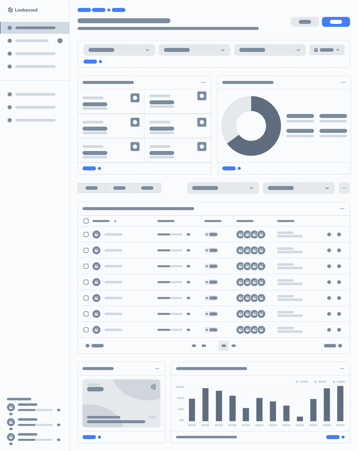
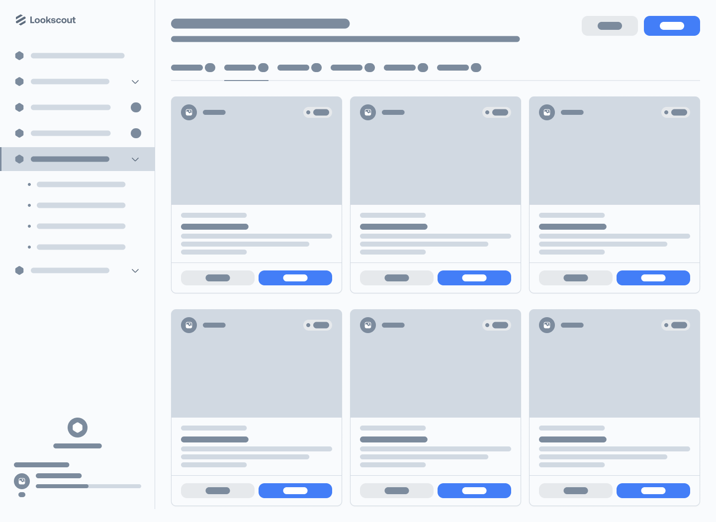
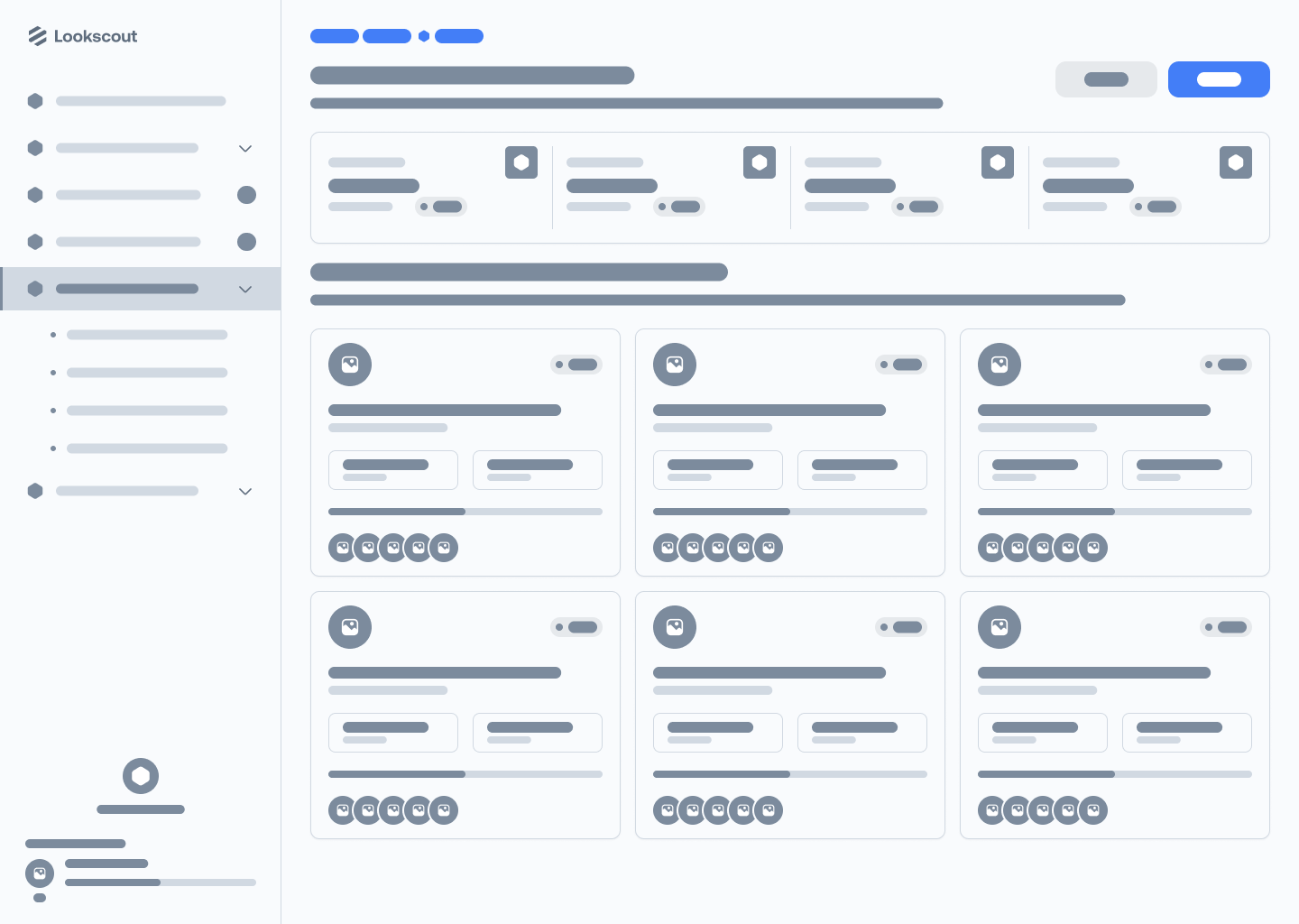
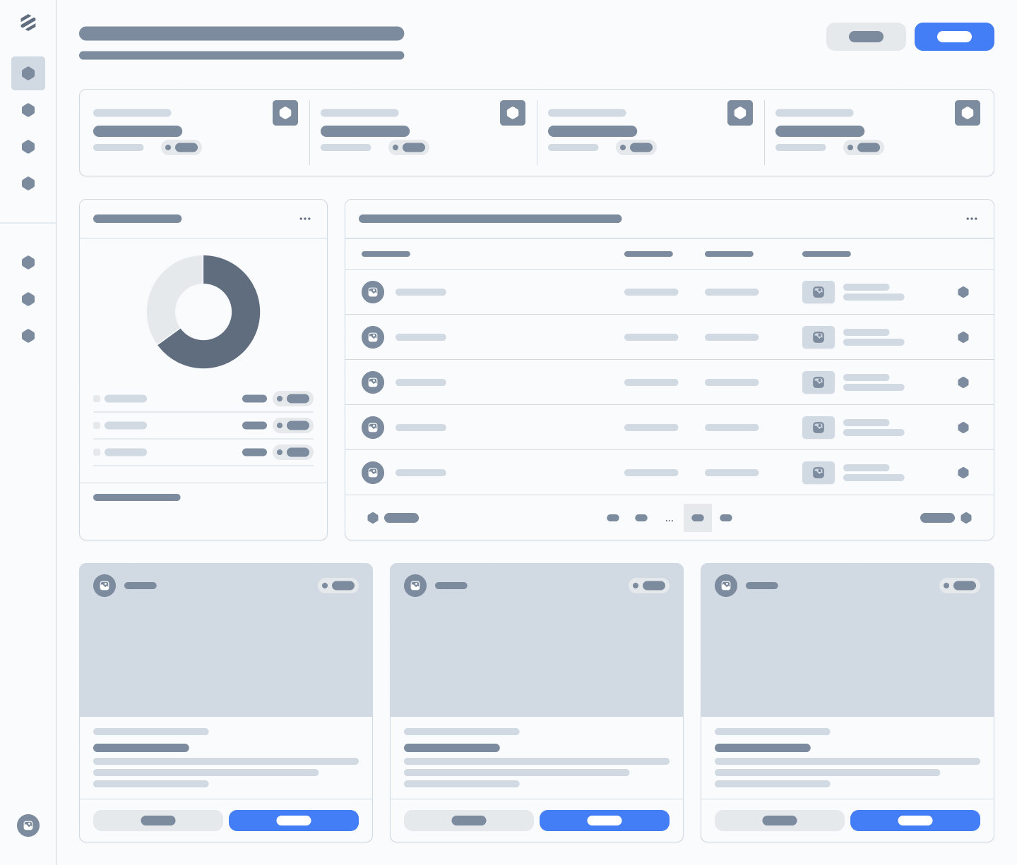
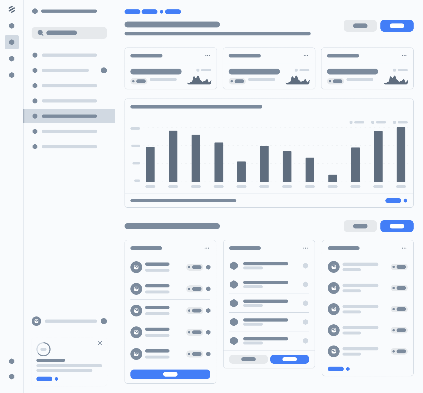
A prominent nonprofit organization with a mission to support various charitable causes decided to improve their online presence and streamline the donation process by revamping their donor portal website. This case study explores the User Experience (UX) research conducted to inform the redesign of the donor portal, with a focus on understanding the needs and preferences of donors.
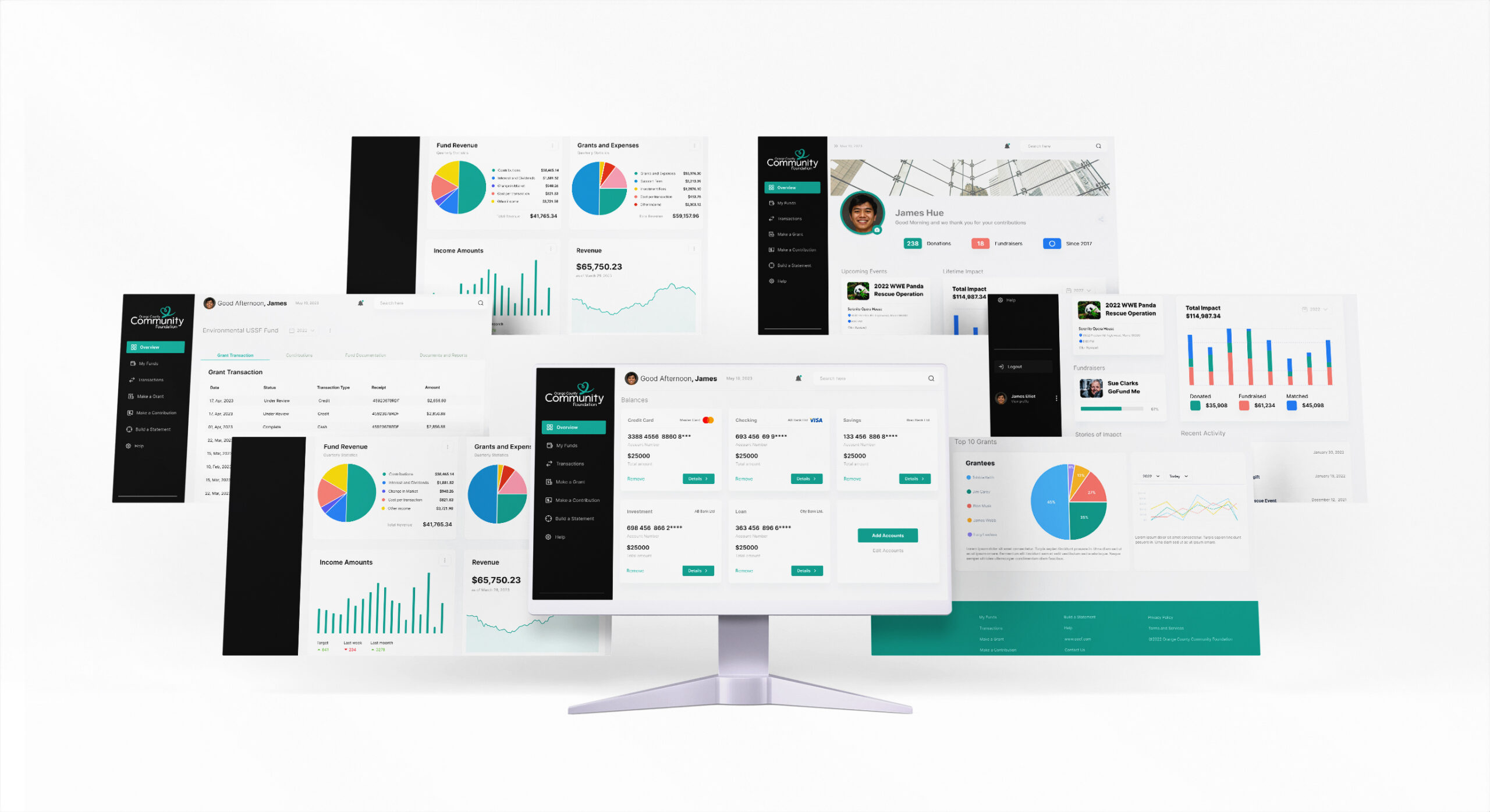
The task at hand was to design and develop a customer friendly donor dashboard. We totally revamped and design the entire framework from scratch. We worked with the stakeholders and brand to bring a more atomic design theme for a all around better user experience.
IDENTIFYING THE TARGET AUDIENCE
Project Goals:
- Improve the overall user experience of the donor portal website.
- Increase user engagement and conversion rates, resulting in higher donations.
- Enhance the accessibility and usability of the platform for all users.
High Fidelity Prototype
Summary
The task at hand was to design and develop a customer friendly donor dashboard. We totally revamped and designed the entire framework from scratch. We worked with the stakeholders and branding to bring a more atomic design theme for a all around better user experience.
USER RESEARCH
1. User Interviews: We conducted in-depth interviews with a diverse group of donors, both new and long-time supporters. The interviewees were selected to represent various age groups, backgrounds, and experience levels with online donations. Key questions included their motivations for donating, their expectations from a donor portal, and any pain points they had encountered in the past.
2. Online Surveys: To gather quantitative data and reach a wider audience, we distributed online surveys to DonorConnect’s email list and social media followers. The survey focused on the website’s ease of use, visual appeal, and the overall donation process.
3. Competitive Analysis: We analyzed the websites of other nonprofit organizations, with a particular focus on those that had recently revamped their donor portals. This analysis helped identify best practices and emerging trends in the nonprofit sector.
4. Usability Testing: We conducted usability testing sessions with a selected group of donors to identify specific issues with the current portal. Participants were observed while navigating the website and sharing their thoughts on the user interface, donation process, and any pain points they encountered.
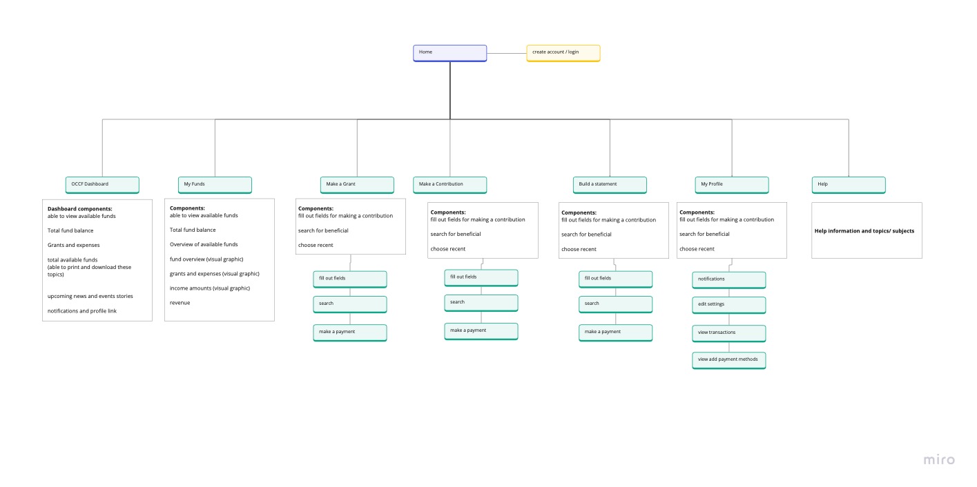
ARCHITECTURE
Donor Dashboard Layout Request:
- Header Section:
- Logo: Display your organization’s logo.
- Navigation: Include links to different sections of the dashboard (Donor Profile, Donation History, Impact Metrics, Messages, and Support).
- Donor Profile:
- Donor Information: Display the donor’s name, profile picture, and contact information.
- Summary: Show a brief summary of their donation history and impact.
- Donation History:
- Donation List: Display a list of the donor’s recent donations, including date, amount, purpose, and status.
- Filter and Search: Allow donors to filter and search for specific donations.
- Impact Metrics:
- Metrics Summary: Show key impact metrics or achievements resulting from the donor’s contributions.
- Charts: Provide visualizations like bar charts, pie charts, or line graphs to represent the impact data.
- Messages and Notifications:
- Notifications: Display important messages or notifications related to the donor’s engagement with the organization.
- Compose Message: Allow donors to send messages or inquiries to your organization.
- Upcoming Events:
- List of Events: Include a list of upcoming events organized by your organization, with details like date, location, and RSVP options.
- Event Details: Clicking on an event should lead to a dedicated page with event details and registration options.
- Donor Support:
- Support Information: Provide contact information and links to donor support or a help center.
- FAQ: Include frequently asked questions to address common queries.
- Logout:
- Include a logout button or link to allow donors to sign out.

